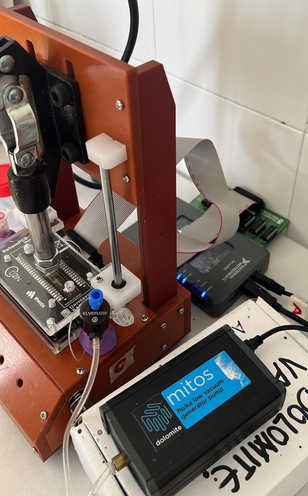
Microfluidic Rheometer
We obtained experimental data from multiple blood donors and patients using an in-house microfluidic device. By setting a pressure difference in a microfluidic channel connected to a blood reservoir, we can make the fluid flow through the channel and measure the time it reaches a given position.
The geometry of the microfluidic channel, the pressure difference and the viscosity of the blood sample are all variables that affect the fluid flow. Moreover, the microfluidic channel is such that the blood velocity is constant at a constant pressure difference. Therefore, to measure different speeds, we must change the pressure difference.
However, this microfluidic device's main difference is that it can characterise fluids by analysing the fluid-front velocity, which is why it needs much less volume. Therefore, given the shear thinning nature of blood, we cannot use velocity as a variable to describe our system. The velocity and viscosity of blood change depending on the shear applied. We need to use a variable that considers all viscosity-dependent variables; the fluid front shear rate. The fluid front shear rate, defined as the mean front velocity divided by the height of the channel (the smallest, or characteristic, dimension of the microfluidic channel), completely characterises the conditions of our system and experiments.
The mathematical model
To characterize blood, we use a power-law model (the Ostwald-De Waele Power-Law model) between its viscosity and the shear rate with an m prefactor obtained experimentally. Using this modelization, newtonian fluids like plasma correspond to n=1. In the case of shear-thinning behaviour, for instance, healthy blood, n should be lower than 1.

Then, to characterize different blood conditions, we need to remove the effect of plasma and hematocrit levels on viscosity. We can do this by normalizing the blood viscosity with respect to the plasma viscosity and obtaining an effective viscosity for blood. Further, we normalize the effective viscosity with respect to the maximum value of hematocrit. We normalize with respect to the maximum value of hematocrit because it is the case for which we will have the most impact on the state of red blood cells. After all, it is where we will have more red blood cells.

It is worth mentioning that the major experimental error comes from the dynamic contact angle and capillary pressure of the flowing fluid. This is because capillary pressure is a static measurement and the dynamic contact angle depend on factors that we cannot control.
It is worth mentioning that the most important viscosity parameter in our model is n. This parameter n gives us information about the dependence of the viscosity on the shear rate; the shape of the curve. m, on the other hand, is a simple prefactor that moves the viscosity along the vertical axis without a more relevant meaning.
Experimental setup
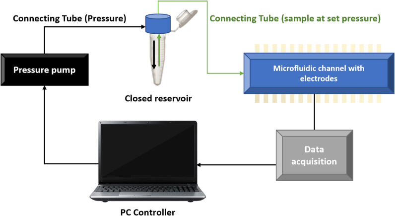
Schematic representation of the microfluidic setup where the pressure difference is set by a pressure pump and the data is collected in a computer. Image extracted from reference [2]
Model results
We have 117 blood samples with the corresponding plasma measurements from which we can extract their viscosity values as a function of the shear rate. By fitting the experimental data, we characterize each blood and plasma sample by (m, n) pairs. From them, we can derive the hematocrit normalized m and n; mhtc, nhtc.
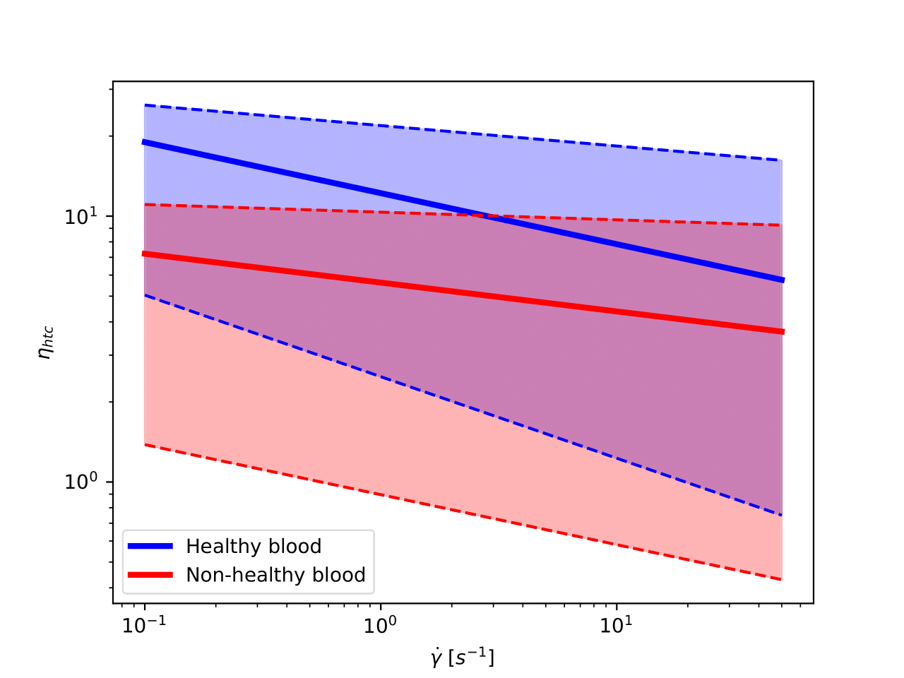
In the following image, we represent the hematocrit-normalized viscosity in a log-log scale as a function of the shear rate for healthy and non-healthy samples. In solid, we have painted the curve representing the mean of each category, and we shaded all the area that fits into one standard deviation of the mean curve.
Next, we show in different graphs all curves for each blood condition on a log-log scale. We do it this way because of the overlapping between curves corresponding to different pathologies.
Note that these graphs only display information on the hematocrit-normalized viscosity.
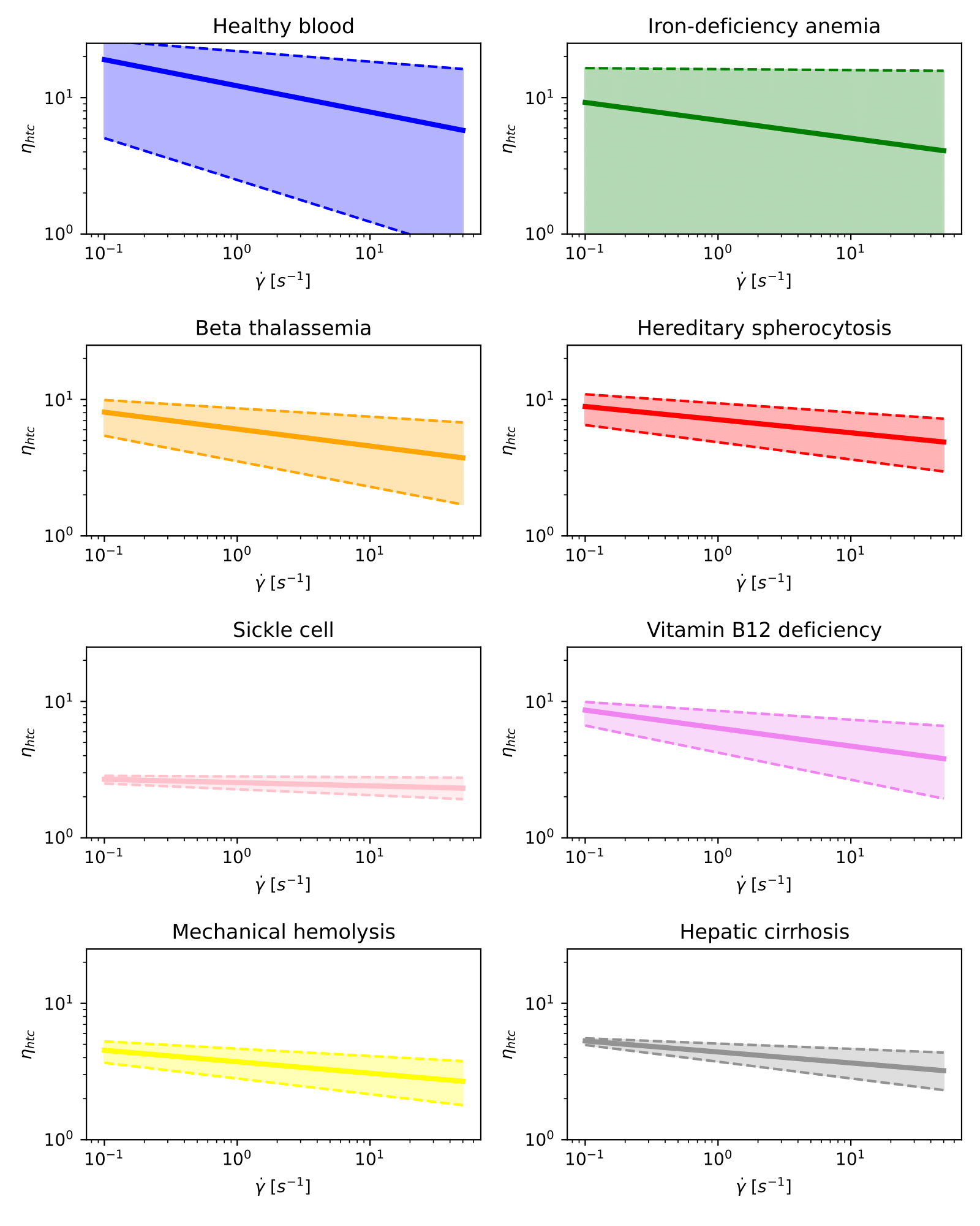
Hematocrit-normalized viscosity curves for healthy blood and different diseases on a log-log scale.
Classification modelling overview
We have done all measurements and characterisations to predict the blood sample state for a given set of characterisation parameters(hematocrit, m and n in our case). Therefore, we will train a model to best map examples of input data to specific blood state labels. We can classify our blood samples into two main groups: healthy and non-healthy samples (binary classification). But because we know the condition of the patients and donors, we can also aim for multi-class classification.
There are many different classification algorithms for classification problems. There is no good theory on mapping algorithms. Therefore, we used controlled experiments to discover which algorithm and algorithm configuration result in the best performance for a given classification task. Even if it is not perfect, classification accuracy is a popular metric used to evaluate the performance of a model based on the predicted class labels.
ML models accuracies
We have fed to our Machine Learning algorithms the 4 viscosity related parameters: (m, n) and (mhtc, nhtc). From the 117 processed samples, we have split the training and the test with 81 and 36 samples each.
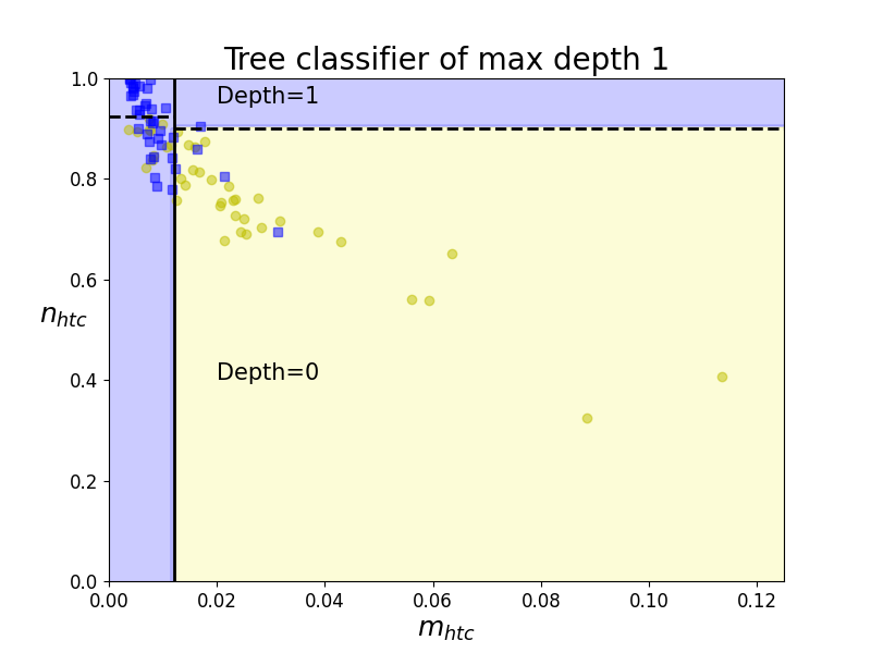
Boundaries of Classification Tree (depth 1)
Decision Trees are among the simplest algorithms to understand, are easy to visualize and implement, and do not require much computation. While simple and easy to interpret, they can classify categories from datasets that a single line cannot separate. The decision tree uses Entropy to find the split point and the feature to split on.
These decision boundaries are always parallel to the axis because it splits the data iteratively based on a feature value - and this value remains constant throughout the boundary. Therefore, it is helpful to take two features at a time to plot the 2D graphs to visualise results and contours in 2D.
In the example on the left, the first decision boundary is at n_{htc}=0.012. Since now we have two decision regions, our tree ramifies to two new different nodes of the tree for each region. And regions are iteratively split until regions contain a significant majority of one class over the rest.
However, Decision Trees present many disadvantages. We will easily develop an over-fitted model if we do not set a stopping criterion - tree-depth, minimum of instances per node, etc. Besides, decision trees are sensitive to data rotation as they make parallel-axis decisions.